If a picture speaks 1,000 words, making sure those words speak to your audience the right way is one of the most important aspects of your marketing campaigns. On a similar note, the typefaces you choose to use for text in your designs must also accurately reflect your company and its brand. In marketing with graphic design, the goal is to have both your imagery and typography work together in your designs to create powerful messages!
Let’s first explore the world of imagery.
The Importance of Image Quality
High-resolution images are the way to go – no exceptions. Think about this scenario: It can be frustrating while you’re shopping online to sift through a digital catalog that contains images you can’t read well or see clearly. Your audience feels the same way; by providing photos that have too low of a resolution, you may only create frustration and may even lose a sale. While making an important purchase, your customers need to be able to see lots of details in your product imagery.
On that same wavelength, image dimensions are very important. If you upload an image that is extremely wide, for example, it may be difficult for your users to dissect the image and its message – especially if they are using a mobile phone. Be sure to test your graphics on mobile as well so you can be sure they are still impactful to your mobile customers. Check out our recent blog, Facebook Media Specs for the Marketer, for some great tips on image dimensions for Facebook.
When you’re working with images in your designs there are a few things to note. First, never stretch or warp your images; try not to crop your images too tightly; and try not to enlarge an image too much beyond its original dimensions. These actions almost always cause pixelation, which is an unfavorable amount of blurriness caused by an image’s square-shaped pixels being stretched so much that they become visible. [Source: Figma]
![]()
The Best Types of Images to Use
The most effective types of images are those that contain people. [Source: UX Planet] Folks tend to relate more closely with images that show other humans, but it is recommended to steer away from overly-staged stock photography. Try to get real-life photos of your product or service (or of your team using said product or service) to really make an impact. Real-life images give people an inside look at your company and can have a very relatable, personal effect on them.
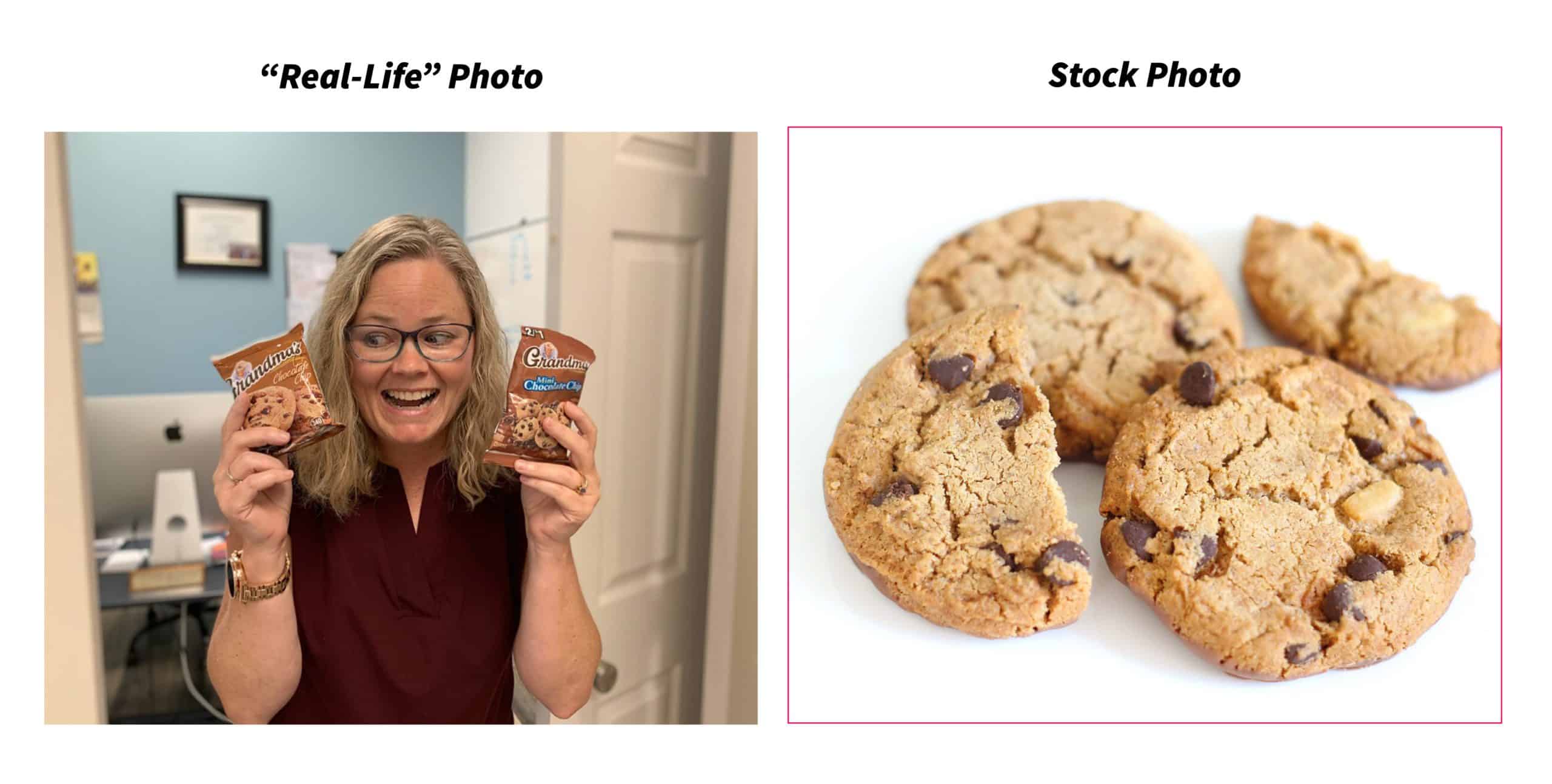 Finally, if you are short on imagery and do need to access stock photos, never simply download images from the internet; be sure you use reputable sources such as Shutterstock, Pixabay (free!), Pexels (free!), and 123RF.
Typography: The Basics
There are several “right” ways to use typefaces. Let’s first begin with a few basic definitions that are helpful to know before understanding how to use typefaces in your designs.
Typeface: A set of one or more fonts. [Source: Wikipedia] For example, Times New Roman is a typeface. It is comprised of many fonts such as Times New Roman Bold, Times New Roman Italic, etc.
Font: A particular size, weight, and style of a typeface. [Source: Wikipedia] For example, Times New Roman Bold is a font. It is a member of the Times New Roman family.
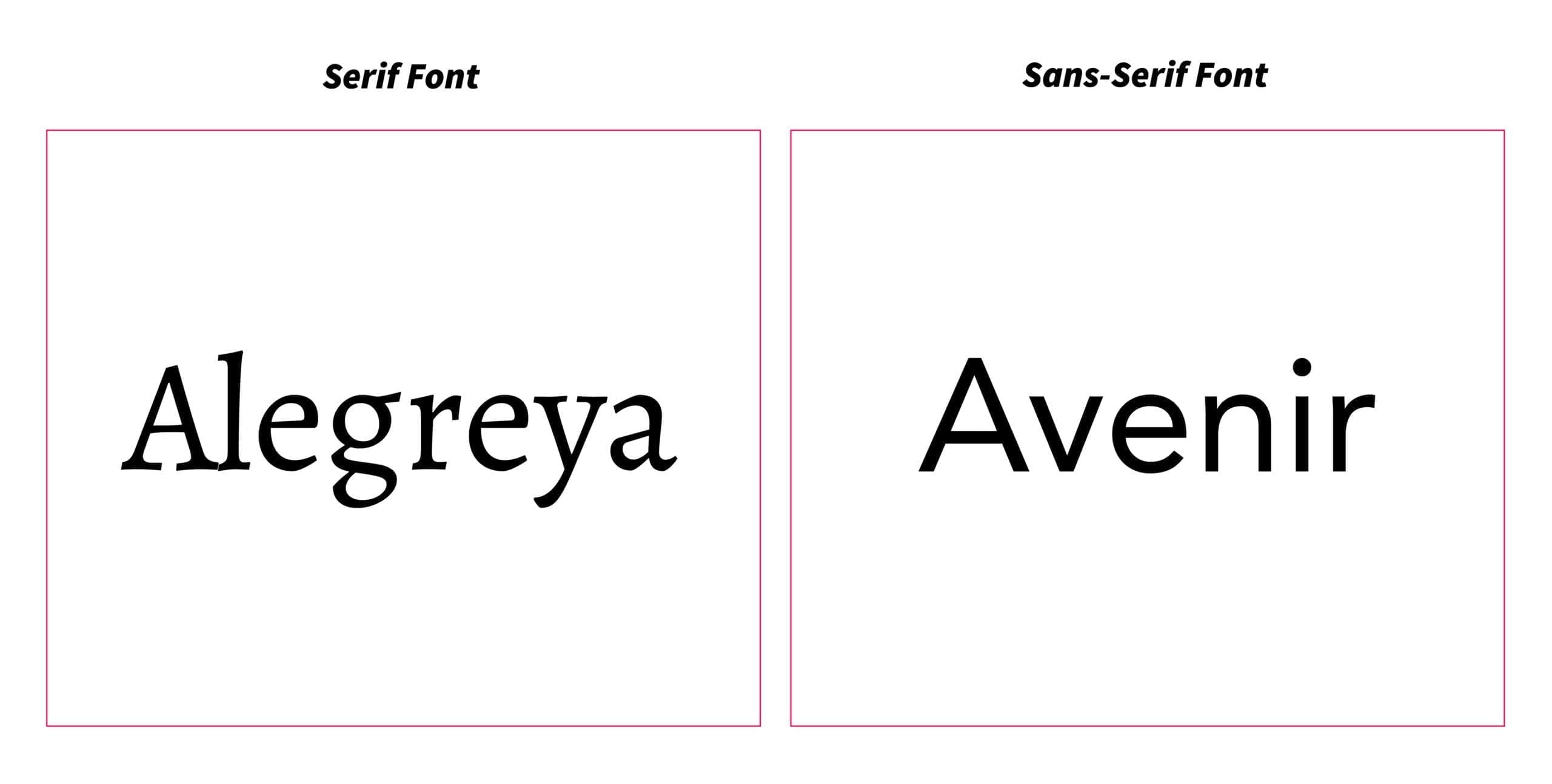
Sans Serif: A sans serif typeface is one that does not have extending features called “serifs” at the end of strokes. [Source: Wikipedia] A great example of this is the typeface is Arial.
Serif: A serif typeface does have extending features at the end of strokes. [Source: Wikipedia] An example of this kind of typeface is Times New Roman.
Typography: Best Practices
Though typography is a complex art, you now understand some important definitions and can use some basic “golden rules” for using typefaces in your designs are below.
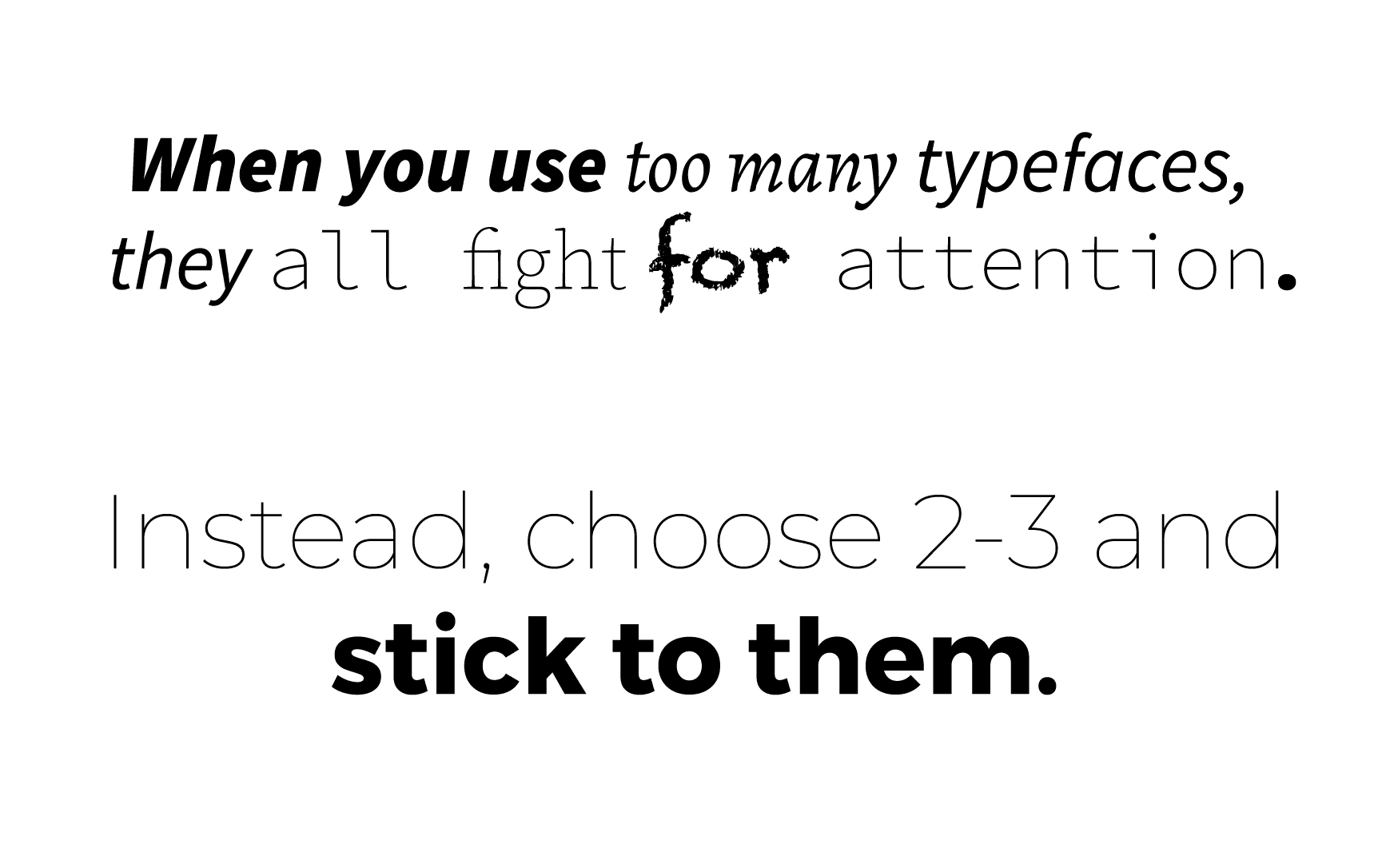
- Use no more than 2 or 3 different typefaces in one design.
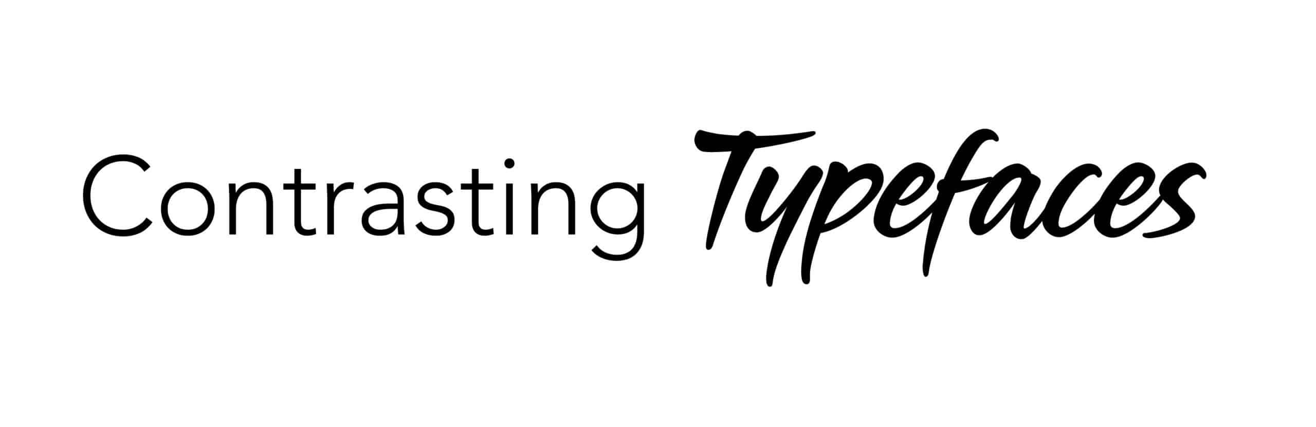
- Try contrasting your typefaces by using a serif typeface with a sans serif typeface.
- Lean towards using sans serif fonts (vs. serif fonts) for clean, easy-to-read body copy and leave script, serif, or otherwise decorative fonts for titles only.
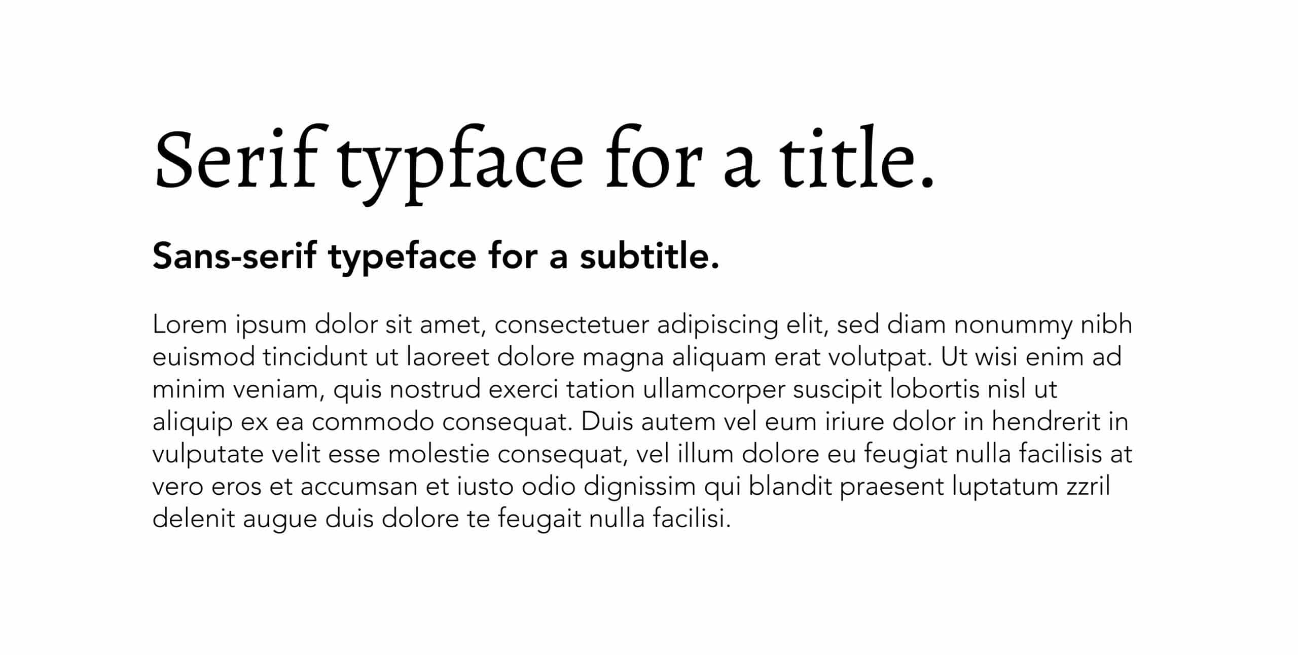
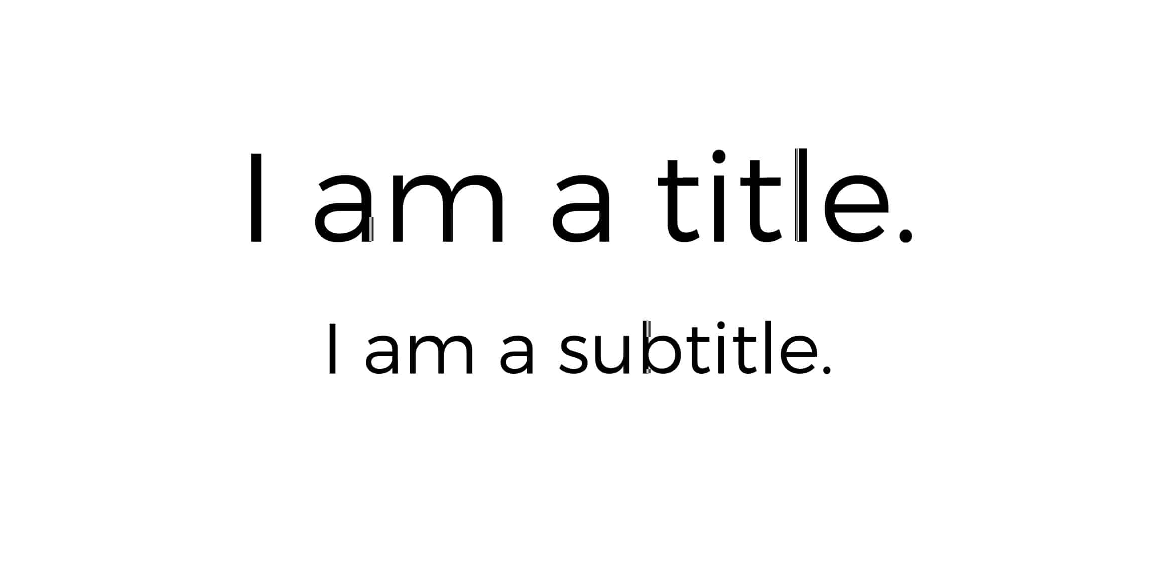
- Stagger your text sizes by creating larger titles, such as size 24, and much smaller subtitles, like size 18.
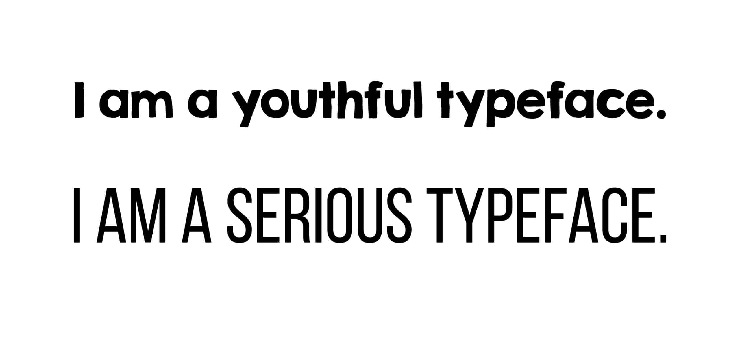
- Use typefaces that adhere to your brand style, and stick to those same typefaces throughout your campaigns. If you are a fun, youthful type of company, use something that speaks to that personality. If you’re an attorney or doctor, try something more professional and serious.
You should now have a good grasp on the basic use of imagery and typefaces in graphic design for effective marketing. Next time, I’ll finish up the Guide to Marketing with Visual Appeal with the final post: Composition. Let us know if you need further assistance with your graphic design, website design, or inbound marketing endeavors!