Websites are becoming so dynamic. Web developers (like me) now have so many new tools and techniques to make unique, interactive websites. It’s exciting to see the trends happening in the web design world and get inspired for future projects.
I’ve noticed five major homepage layout trends so far in 2018:
- Unique text displays
- Short top-level Navigation
- Good Ol’ Hero Images
- Split Screen Layouts
- Grid Layouts
1) Unique Text Display
Ever since 2010 when Google fonts launched, having beautiful fonts on your website has been pretty easy. Web designers can choose between hundreds of high-quality fonts to find one that fits their brand personality. Recently, I’ve noticed web designs becoming even more experimental with font choices and sizes. Especially in the industries of technology and design, I’ve noticed bold new text effects including:
- Somewhat off-screen text cropped by the edge of the page
- Huge letters taking up most or all of the first page
- Vertical Text
- Experimental text effects and masks
- Animated text
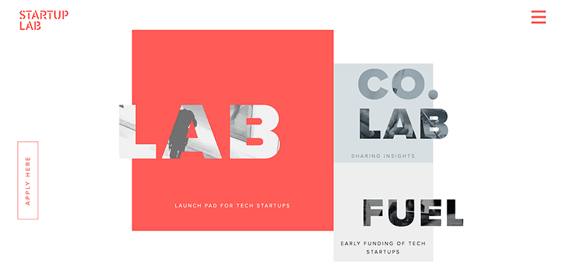
Here’s an example of a fun text effect by Startup Lab, using large text with an image background that dynamically moves when you hover over it. Check out this sweet effect here:
2) Short Top-level Navigation
Many websites today embrace a minimalist design, using only the elements necessary to convey a clear, direct message. Clients often ask us for this type of design by asking for a “clean” or “modern” design.
An important element of minimalism, I’ve noticed, is a short, concise main navigation. Gone are the days of 15 links in two or more rows on the top of websites. Now, modern designs often use only 6-8 top-level links at the top of their sites. Even huge sites with hundreds of pages are opting for this design pattern. Check out the minimalistic navigation for Stripe and Intuit, two big sites who’ve narrowed down their main navigation to just a few links.

So what happens to all the rest of your links? Don’t worry, you can still provide secondary navigation in your design. Many companies include these larger lists of links at the bottom of their pages.
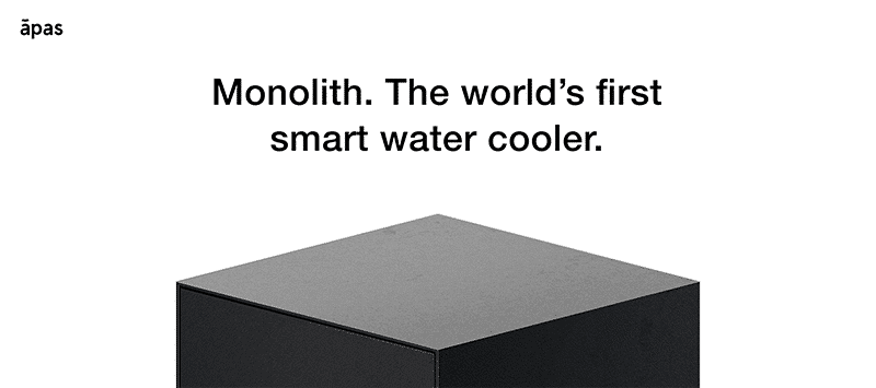
Some companies are even opting for no menu links at all. Instead, they tell their stories through interactive one-page scrolling sites. Check out Apas for a great example of this.
3) Good Ol’ Hero Images
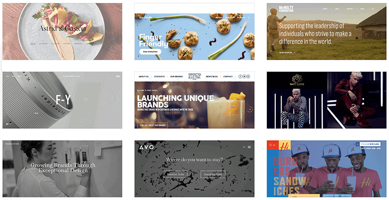
Yes, the hero image is still in style and has been for several years. Hero images can beautifully portray who your brand is without a single word. These images capture a viewer’s attention and peak their interest in a brand’s products or services. Of course, you must choose your hero image carefully. A stock photo or other generic photo can actually harm first impressions and make your company seem bland or boring.
Look at all these beautiful examples of hero images from webdesign-inspiration.com.
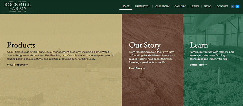
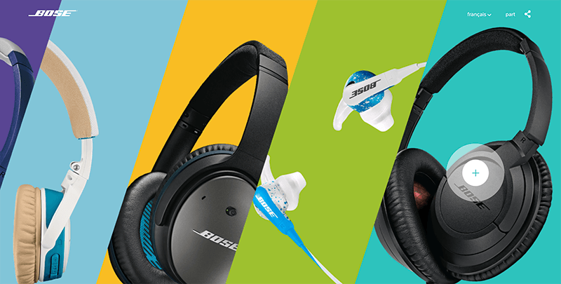
4) Split-Screen Layouts
Split-screen layouts are also very common in today’s website designs. This type of homepage design is a great choice when you have only a few specific actions or links you want your visitor to choose from.
Here’s an example of a split-screen layout from Rockhill Farms’ homepage.
Here’s a landing page from BOSE advertising their new headphone products. The page uses split-screen layout to let users explore each option to learn more.
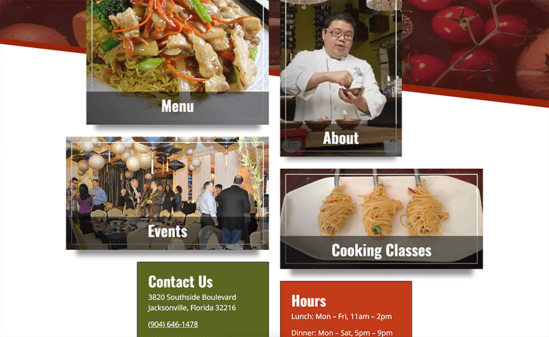
5) Grid Layouts
In the past couple of years, CSS got a major upgrade with the new flexbox and grid layout techniques. These new features allow web designers to experiment with unique new grid-based layouts. Just make sure that when you use these new techniques, you also write fallback styling for browsers that don’t yet support flexbox and grid.
I love the unpredictable designs that CSS grid and flexbox can achieve. Look at this fun grid-like layout for Blue Bamboo restaurant in Jacksonville, FL.
If you want to learn more about what CSS grid can do, comment below and I’ll respond to you.
Are you looking to redesign your website for 2018? Check out our web design page for examples of our work, or schedule a free consultation if you want to get started right away.