If you’ve already decided on what fonts and colors you’d like to use in a design, you’re halfway there when marketing with graphic design. Now, it’s time to put all these elements together into one cohesive design – otherwise known as composition. Composition is the manner in which a designer organizes elements in their designs. These elements include text, images, and graphics.
Avoiding Clutter and Confusion
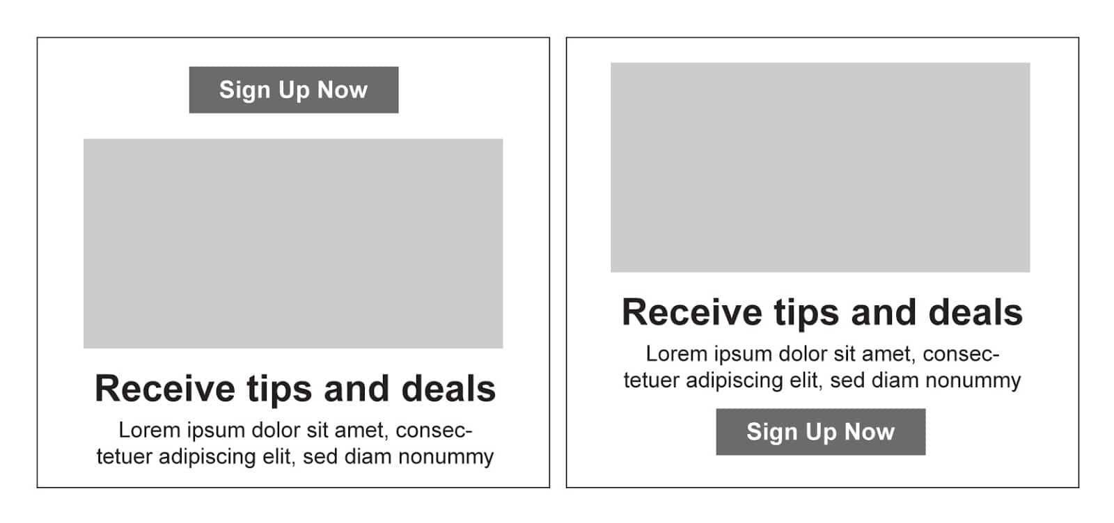
The goal of your designs should be to communicate a message as clearly and simply as possible. Cluttered or otherwise confusing composition will make it difficult for your audience to understand your message. Avoid placing too many elements in one area – you’ll want to leave room for your design elements to “breathe.” Make sure you place elements in areas that make sense as your audience views your design. In the graphic below, can you decide which design would make more sense to an audience?

Having a Purpose
When you go to create a design, ask yourself, “what is the purpose of this design?” Are you trying to entice the user to fill out a form? Are you simply informing them of something? Are you trying to get them to click something or even download something? When your design is finished, you should be able to put yourself in your audience’s shoes and tell whether or not you’ve fulfilled the purpose. If your design does not clearly convey the message, you may need to make some edits.
You should try to pick only one goal per design so that your end users are not bombarded with information. This means that your designs should be created to communicate one single thing, versus several messages at a time. This will only cause a viewer to become overwhelmed.
Keeping it Simple
There are two main ways to make sure your designs stay simple. One is to use plenty of whitespace. The second is to remove anything that’s not absolutely necessary. Whitespace is the blank, empty space left around text and imagery. It can help break up your design and help it to appear uncluttered to your audience. To achieve whitespace in an existing design, try scaling down elements of your design.
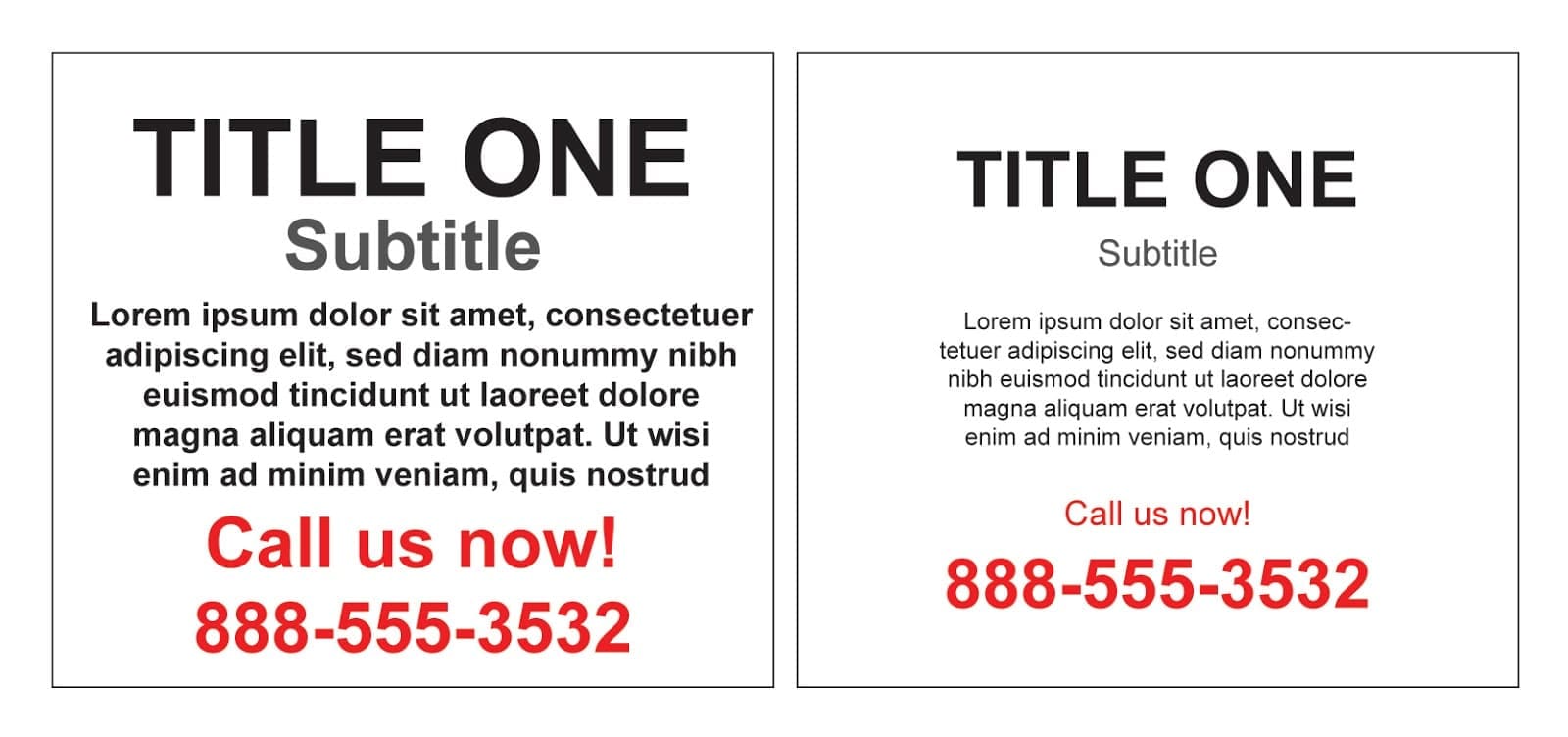
In the graphic below, the left side appears cluttered as many of the elements fight for attention. On the right, some elements have been scaled down – now, the title and phone number are very prominent compared to the other elements in the design.

How do you know which elements to eliminate to help keep your composition simple? Here are some ways to figure this out.
- If there is an element in your design that is repeating a message that is already communicated by some other element, there’s a good chance it can be removed.
- Only provide the contact information you absolutely need. For example, if you only want viewers to visit your website in order to contact you, it won’t be necessary to include a phone number or address in your design. If these pieces of information are included in your design, remove them and see if it helps improve your composition.
- Try to pick the very best images only, or even just one great image, versus including several different images in your design. One great image will catch the eye more quickly than several mediocre images.
- Consider making your main message the largest element in your design, or the focal point, and making the other elements smaller to help keep the focus on that one big message. Whether it’s an image or a title, it should stand out from the less important elements of your design.
- Use these tips along with using 2-3 colors and a couple of different fonts at most, as discussed in Parts 1 and 2 of this blog series, you are on your way to creating a simple, clean composition.
If you’d like to dig even deeper into designing with composition, Canva provides a great blog post that covers more in-depth design techniques.
For more information on the first steps to creating compelling designs for your marketing, see Part One: Color, and Part Two: Typography and Imagery.


