Whether you’re working on a document that will be showcased online or printed from that ancient inkjet on your desk, something to be projected in a big screen at the AGM or rolled off a huge four-color press, every document you’ve worked to design or write has one thing in common: typography. Designers and press geeks will use a whole slew of words to do with typesetting that may leave you mystified, but today, our team is ready to give you a crash course in all things typographic so you can better understand both what they’re on about, and how you can make suggestions for improving content in the future.
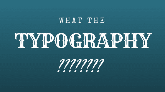
What is Typography
First things first, typography is quite simply the art of putting text together. How words and characters are arranged and displayed, from the selection of a font to the choice of size, color, spacing, and any number of other variables – that is typography. Congratulations, you’ve been working with typography as long as you’ve known how to type.
The value of good typography is rarely acknowledged, because when done well, typography doesn’t leap out and grab your attention, but rather facilitates easy reading and understanding of information. Bad typography, on the other hand, can ruin a product launch, cause a book to undersell, or get your resume thrown right in the recycle bin.
Basic Typography Terms
So, let’s move on to the details for discussing typography by explaining a handful of the most common typographical terms:
- Font: in terms of modern typography, a font is the typeface you choose from the menu on your computer. Traditionally, a font is a specific size, weight, and style of a given typeface.
- Point: a point is a design measurement equal to 1/72 inch, this is the most common way that type is sized. If someone says to use “12 point type” the resultant text will be roughly 1/6-inch tall (12/72nds).
- Baseline: this is the imaginary line where the characters in a typeface rest – think of it as the line you’d be writing on in a notebook.
- Cap height: this is the distance from the baseline to the top of a capital letter in your chosen typeface.
- X-height: generally this point is halfway between the baseline and the cap height of a given typeface – it’s the height of the body of a lowercase X.
- Serif: the little curved “feet” that project from the characters in some fonts are known as serifs. Often the terms serif and sans-serif are used to sort typefaces into two broad categories (those with and without these finishing strokes).
- Ascender/Descender: ascenders are the portion of a letter that rises above the x-height – like the stem of the h. Descenders are the portion of the letter that plunge beneath the baseline.
- Ligature: when an element of one character bumps into the next character, seeming to join them together, this is called a ligature. While ligatures can compromise readability, they can also add desirable styling in some situations.
- Kerning: the means of adjusting the space between two letters is kerning, this can be handy when working with display text, like headings – it’s an excellent way to “disconnect” words that end up joined together by a ligature.
- Tracking: like kerning, tracking applies spacing between characters, but instead of applying just to pairs of letters the space controlled by tracking applies to the whole word.
- Leading: this is the space between lines of type, measured baseline to baseline. Generally, more space between the lines improves legibility.
Understanding the mechanics of typography, and these basic terms, can help you make better use of type when putting together any sort of text for others to read. If you’re interested in learning more about the power of typefaces, a great way to start is by exploring some of the free font libraries available online. Start by comparing the variables to see what sort of type might suit your next project, you’ll be looking for the best bowls, stems, and spines in no time.